Inside Mini Moderns
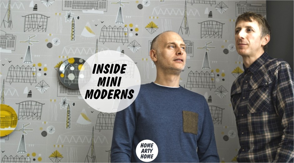
Today we dive into the world of Mini Moderns, the creative and business partnership of Keith Stephenson and Mark Hampshire.
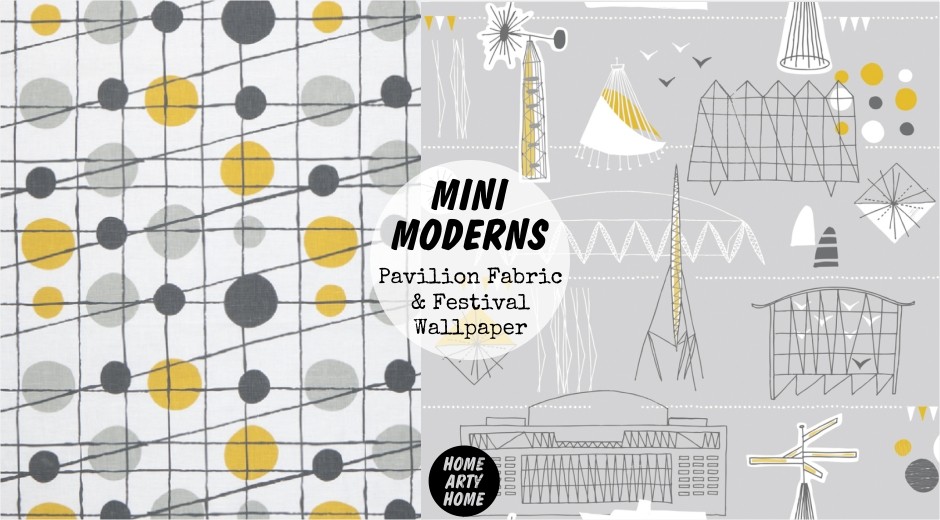
With a contemporary spin on mid-century modernist design, the brand has developed a range of desirable wallpapers, bedding, and accessories that add an instant hit of pattern and colour to a scheme. With stockists across the UK, from large stores such as John Lewis, to independent design boutiques, Mini Moderns also export their distinctly British designs to stores across the globe.
We love the British aesthetic of Mini Moderns’ designs, whether it’s referencing the Festival of Britain, the Kent coast, or London transport. We caught up with Keith to find out more about the home design brand that’s become an independent British success story.
How did you get started? What made you want to create and launch your range?
“I worked as a textile print and graphic designer for various fashion companies ranging from jeanswear to cult fashion brand Red or Dead where I was for several years – Mark had worked in television and had also created his own interior designer-maker business selling his collections through Heal’s. We met at a branding agency in the mid nineties – where we were always put together as a team for projects, so we always knew we worked well together and had a similar aesthetic, a similar approach to projects and most importantly a similar sense of humour!
 We then migrated to another design agency where we also worked together – Mark as a brand strategist and myself as creative director. We always felt that some of our skills were not fully utilised and so when we left our full time jobs, we set up an independent branding agency specialising in retail and lifestyle brands. This led to a commission by an interior boutique to design a wallpaper collection for them in the early 2000’s. The resulting collection was an immediate success, with a lot of international press attention and was shortlisted for Elle Decoration’s Future Classic awards. To exploit Mark’s experience of home accessories design and my experience in print design we built on this success by creating our own independently financed collection of wallpaper, and Mini Moderns was born. It utilises our experiences in design and print, as well as our branding expertise.”
What’s the creative process for you? What inspires/influences your work?
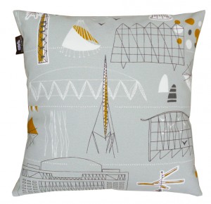 “We are very eclectic in the way that we work. As we are very hands on, from design through to production, and then onto dispatch – we don’t have a set process on how or when we design the collections. Inspiration can come from anywhere, and are primarily based on personal experiences, this can be travel, either in the UK, which inspired our holiday-at-home collection ‘Daytripper’, or international travel. Second hand or vintage fabrics and patterns from the 1920s right up to the 90s are also something we find inspiring. We are influenced by any kind of media, for our ‘Buddha of Suburbia’ collection we created our wallpaper patterns as an illustrated homage to the book of the same name by Hanif Kureishi, and we also watch a lot of social history and pop culture programming, which can give us a mood or theme which we will then visually pursue.
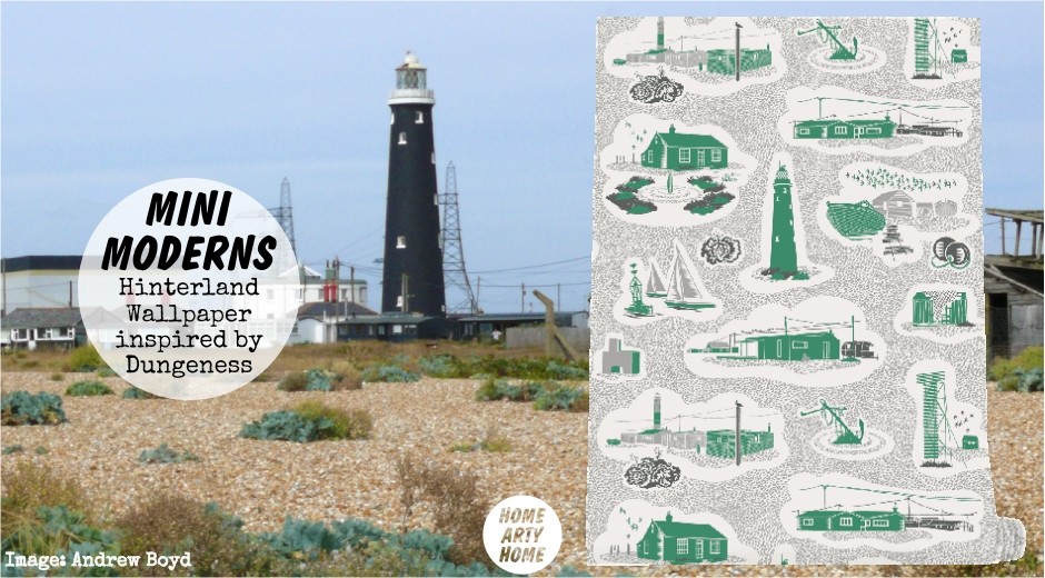
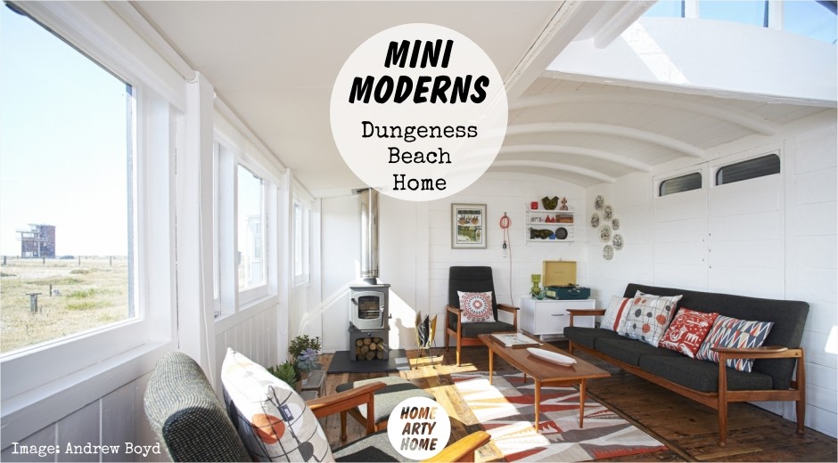
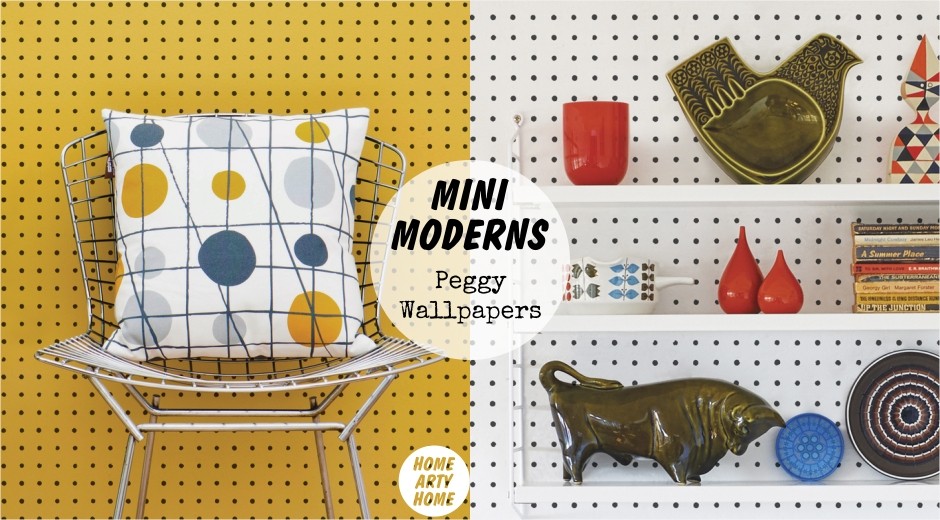
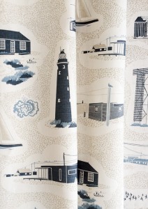
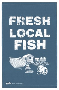
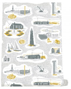 ‘Hinterland’ is a very personal collection. Mark and I spent the last year renovating a converted railway carriage on Dungeness Beach, which has become our beach house. The prints are inspired by the Dungeness headland and the surrounding Kent coast. ‘Hinterland’ explores the history of the area and our aim is to capture some of the magic of the beach environment with its shingle, big skies, structures and points of interest that anyone exploring the surrounding area will discover. We have completed two designs for the collection, the ‘Dungeness’ print is a personal response to the area, and even features our beach house on the design while ‘Peggy’ is inspired by one of our favourite second hand shops on the Kent coast.”
 Are your items screenprinted or digitally printed?
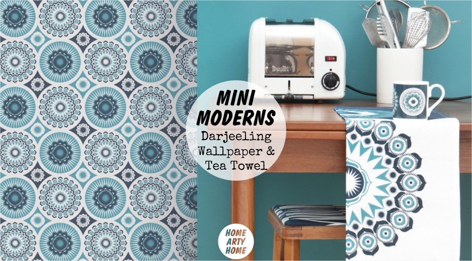
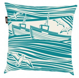
“We have a number of ways that we produce our collections. Our wallpaper is produced in a traditional flexo method, where the design is engraved onto rubber rollers. We design the wallpapers with this in mind. The technique creates a slight movement, which is reminiscent of traditional woodblock printing, and doesn’t give a hard edge to our designs. This is something we could never achieve with digital wallpaper. Our fabric, cushions, bags and transfers for our china are all hand-screenprinted.”
Where are your items made? Do you make them yourself?
“Although we design everything we do, we don’t make them in house. We have our collections produced in factories, though the word ‘factory’ doesn’t really evoke the level of craftsmanship, skill and care that goes into our products. Most of our factories are small artisan run establishments, where colours are mixed by eye which makes our palette unique. We also produce nearly all of our products in the UK, in factories where we get to know the people involved in the process. We brand all our products made this way with the standard ‘Made in the UK by Nice People’ as we feel privileged to work with such great manufacturers.”
Do you have any collaborations on the go?
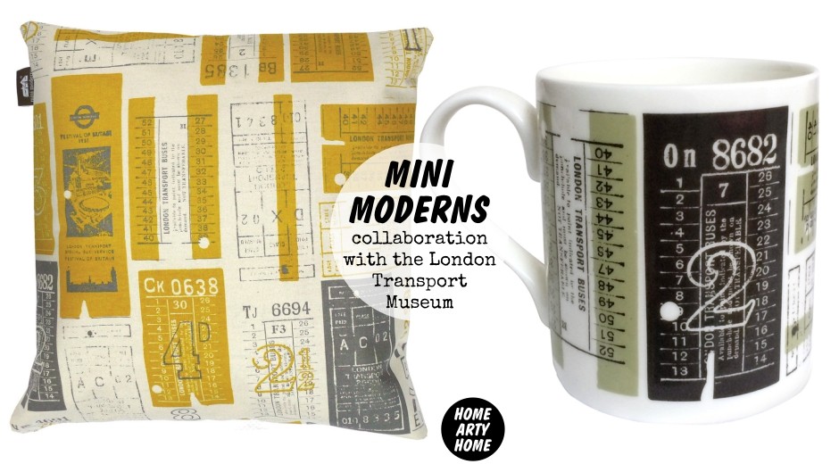
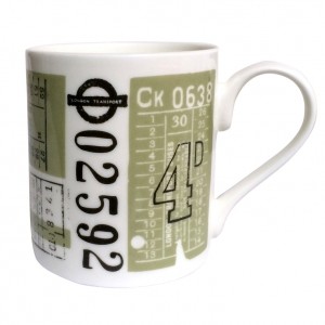 “This year we have a number of exciting new commissions and collaborations. We are working with a number of museums and heritage establishments that are always great fun to work on. We are creating a range of products for 2014 Year of the Bus with the London Transport Museum in London. It is such an inspiring project that we ended up with 14 print designs for them and, although only 5 were selected to use across the product range, the team at LTM loved all of them so much that they are being produced as a postcard book with all of the prints showcased. Other projects in this field include a product range for a large theatre and a new art gallery.
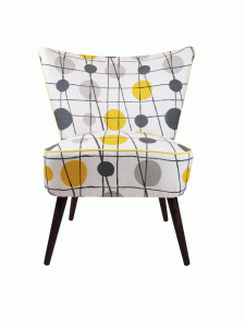
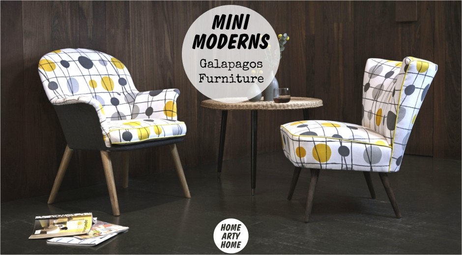
We are also creating a collection of prints for the 20th anniversary of Camberwell Arts Festival, which is where our home and studio is based and launching soon is a collaboration with Galapagos, a furniture company that beautifully reupholsters post war furniture in contemporary fabrics.
We included a couple of the pieces from the range at Home London last January, with more being added to the collection in April. In the pipeline too – which we have been working on for the last couple of months – is a kitchenware range under licence which launches in January 2015.”
 You have various product categories at the moment – are there any new products you plan or hope to add?
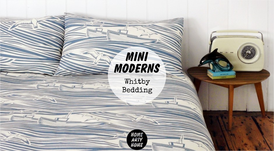
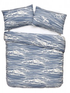
“Our bedding collection is very new, so we are mainly concentrating on that for this year.
We also haven’t had chance to fully explore our lighting range and shades collection as our linen fabric is also very new.
We are always open to thinking about new product ranges as opportunities arise. Until the opportunity arose, we hadn’t any intention of doing paint or bedding, yet now they sit happily in our collections.”
What do you hope people feel when they see your work or bring it into their homes?
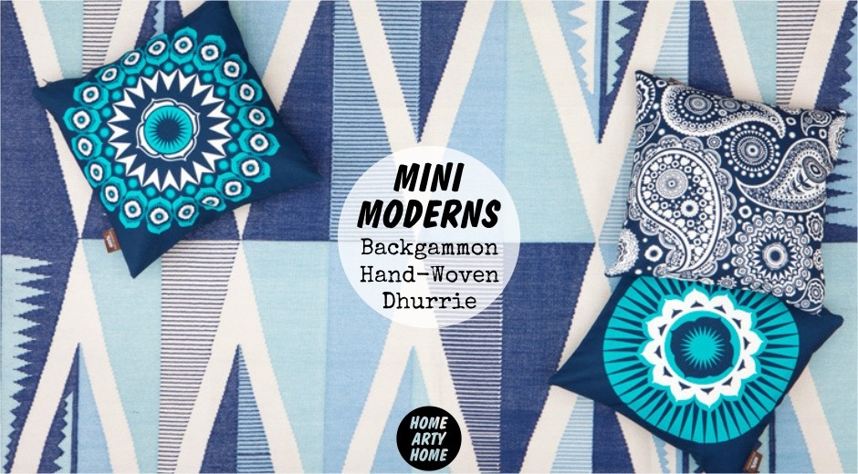
“Many of our designs have a strong narrative running through the pattern – think Paisley Crescent, which is made up of icons relating to the book that inspired the collection, ‘The Buddha of Suburbia’. So we hope that these themes and ideas will resonate with people and spark a smile of recognition. And whilst our designs do bear a strong Mini Moderns handwriting, we hope that when people introduce them into their homes they feel they become part of their own personal style. We still find it incredible that someone should choose to live with our products everyday, in their own personal space.”
 Finally, are there any events coming up in 2014?
“The full ‘Hinterland’ wallpaper collection will launch in a special window display at Southbank Centre in September as part of the London Design Festival, which is very exciting and in January 2015 we will be showing at Home London, which moves venue next year, so it is going to be very interesting. Our last show at Home was really successful and we really enjoyed it; it’s great to be able to create an environment for your products, it’s like having a temporary shop where you are in charge of the whole look of how you would want to see your brand displayed.”
Visit the Mini Moderns website to browse the full range.
All Images: Mini Moderns / Dungeness Images: Andrew Boyd Photography

